Just a small detail, but I’ve been playing around with the United award search tool for the last couple of days and have been noticing that they have been playing around with some UI changes with the award availability calendar.
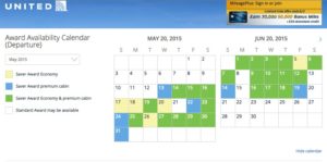
The new UI that they rolled out sometime last year looks like this:
Days with only Economy availability were yellow, days with only Premium economy were Blue, and days with both were green.
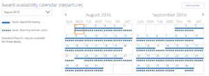
I was searching for award space today and got this:
Days with Economy availability have a solid line through it, and days with Premium availability have a dashed line through it. I’m not entirely sure how I feel about the changes, maybe it is easier to view the specific availability that you want, maybe it isn’t.
I actually noticed some changes yesterday too, where they were playing around slightly with the color scheme, with grey instead of white for no availability, but was similar to the old UI. I don’t have a screenshot though.
I would probably expect further tweaks in the coming weeks!


